![]()
So we have seen from the previous example how the Branch Information Tool can be used to quickly display location related data as a lookup tool, but with the introduction of mapping data has become much more than just that.
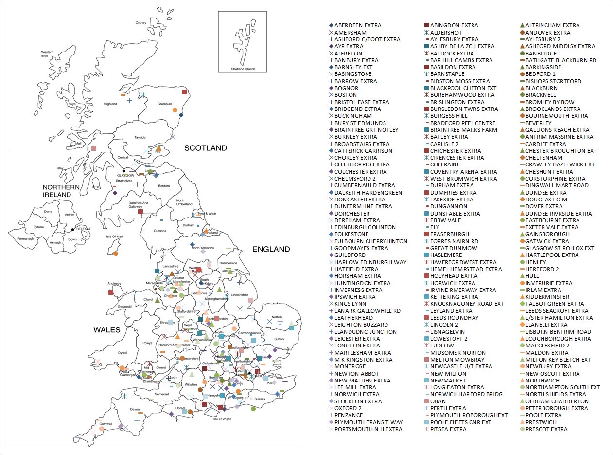
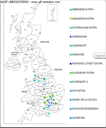
The lookup tool itself is extremely useful as a quick reference guide, enabling us to look up various pieces of location information by selecting data that identifies that location and clicking the relavent icon. The identifier could be a location code, the location name, or as we have seen it could be a term which identifies a group of stores (e.g. ADDRESS_LINE_4='LONDON'). If the data returned includes the mapping East and West co-ordinates we can add that data to a map. The example below shows how points have been added for a large group of locations ;
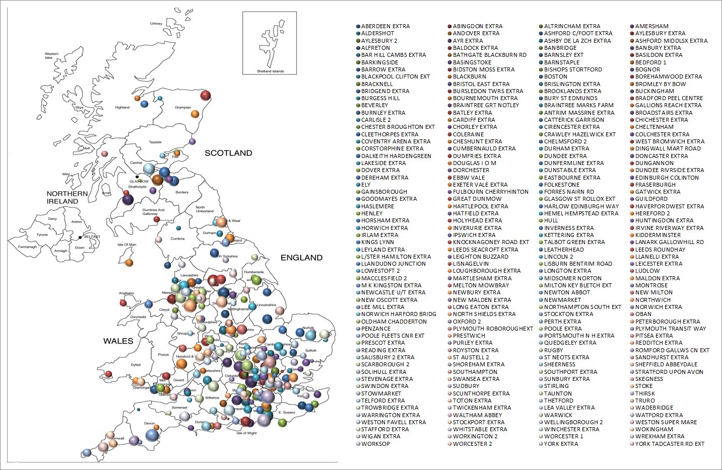
The above map is useful because it shows the position of each location on a map. To truly visualise our data, and see how it looks regionally, it would be better to be able to show each point relating to real information about that location (e.g. Sales of Widgets) as shown below ;
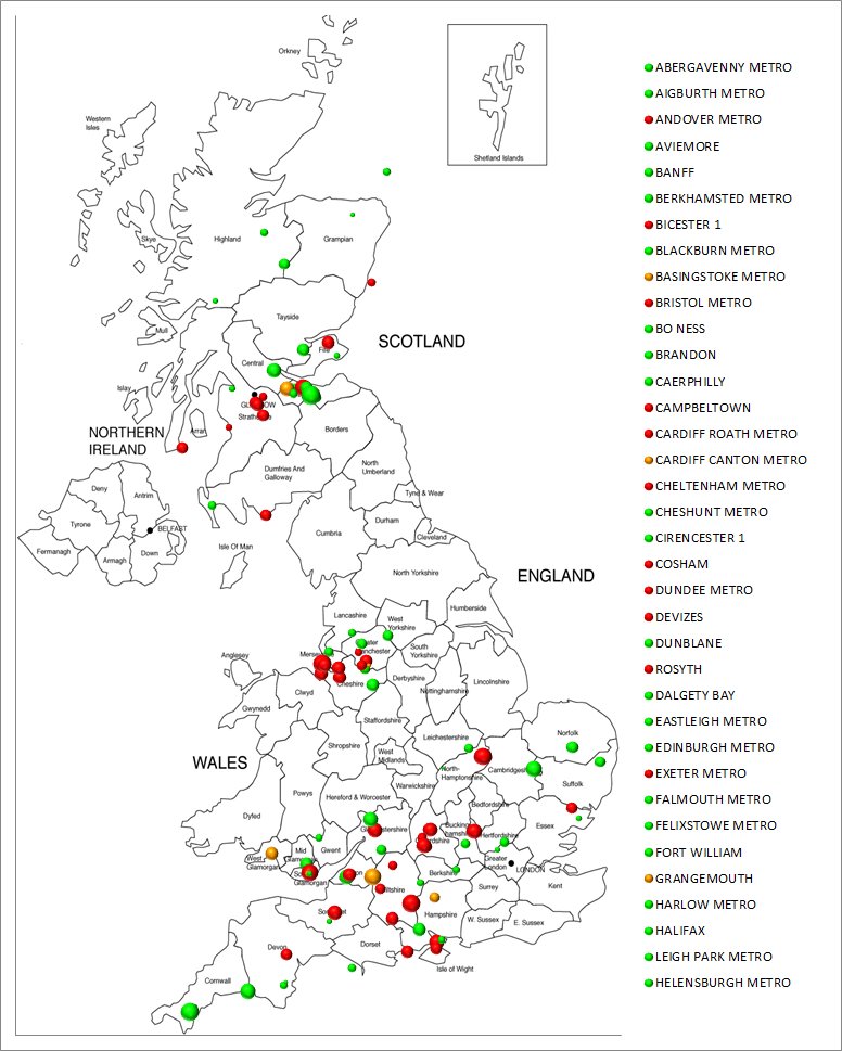
For more complex reports, we sometimes traffic light data, for example against targets to show instantly which locations have met their targets and which have not. The Branch Info Mapping functions allow the individual points to be coloured according to the traffic light colours as shown below ;
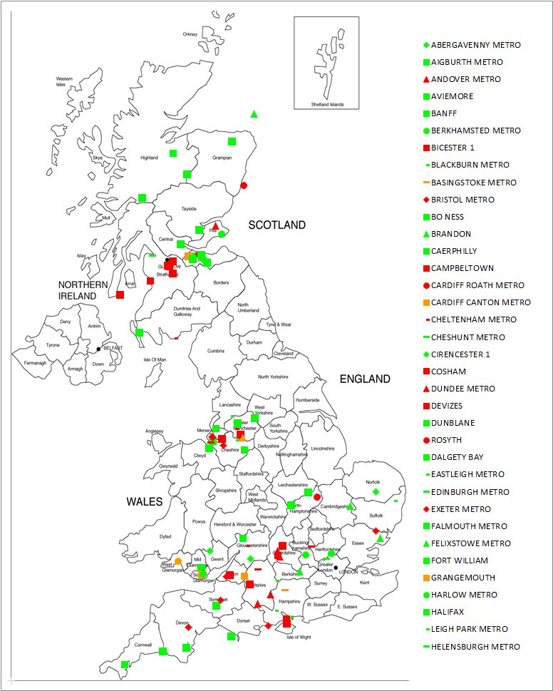
This example shows how we can check for a regional problem, or benefit of locations being in particular areas, and the example below shows how we can use both traffic lighting and point sizes to review our data on a map ;
Maps which are displayed in this way can be driven from the data looked up at the time the icon is clicked, or from data exported at the time the export button is clicked. Options on the export form allow the user to choose to export either the data they can see on the branch information form, or a query. If the user chooses to export a query, they can either link it to the original selection of location data or to the cell references they had originally selected, and a tick box is available to allow this data to be automatically updated when the cell values change.
These options are very useful if the map is to be drawn alongside a report, where the location data on the report can change (if for example, a drop down box enables the user to select a different region for the report).
Perhaps the most significant feature of the exported data is that it uses straightforward Excel formula and tools to display the map. The user can design the maps to display alongside their report, and send them to any colleague in their organisation - even if that colleague does not have the Add-Innovation mapping add-in installed.
New for June. Maps are evlolving ... Two new features added ; Heat Map of points ; Animation of location additions.
Adding locations on a map in Excel is useful for showing several things at a glance ; nationwide coverage, location intense areas, location weak areas, etc ... All are displayed in 2 dimensions quite simply, but with the addition of linking point sizes to other data items adds another dimension. Add to that the ability to colour code points according to other cells in a traffic light style adds another dimension. Now we've looked at two more dimensions ; Colour coding points according to the value of other data in a heat map style, and animating the addition of points to help truly display a growth pattern.
The Heat Map of points is created by colouring the highest (hottest) values red, with values scaled in colour through green, blue, and finally black for the lowest (coldest) values. New options on the export form allow us to choose from automatic point colour ; to colour linked to a cell ; or heat map. Two examples of heat map reports are shown below ;
Adding animation to the maps adds another dimension to the imaging of the data. This enables us to visualise more easily not just where the locations are, but in what order they were added. Adding points which define a time scale (e.g. the open date of a location) can also control how quickly each point is added, which can help to show the pace of market penetration. Example below ;
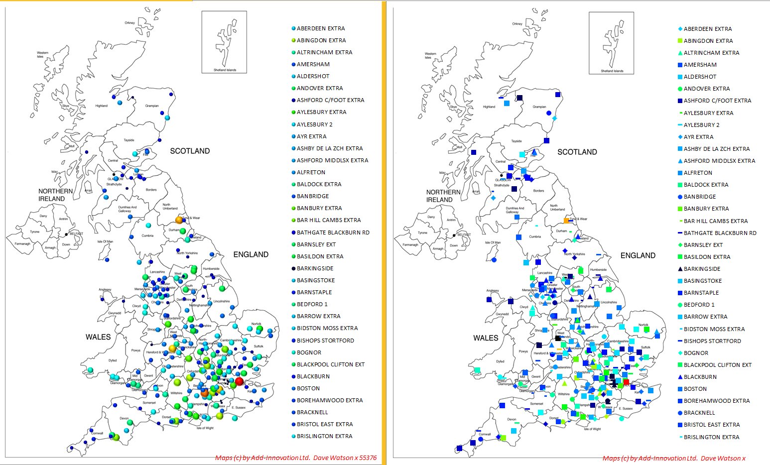
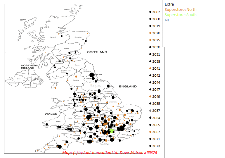
New for week ending 14 June 2014. We have seen from the examples above that many dimensions of our data can be represented on the maps. This week we have added categorisation. Now we have enabled a column to be selected which will be used to categorise our data, and colour each point according to those colours. The categorisation is represented by a second legend on our chart, which is added to the right of the map as shown in the example below, where the format of individual stores are shown as seperate colours. The categorisation is available for bubble charts and for charts with different marker styles.
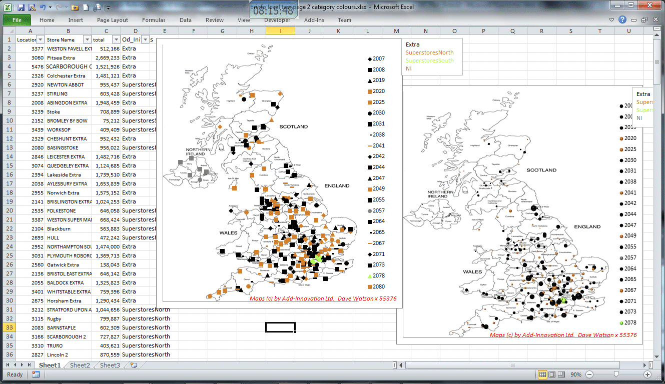
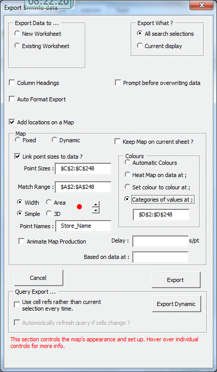
The form below shows selection of the category range in use, along with some more new options which have been added this week to help control the appearence of bubbles in terms of the size relative to eachother (shown as a red dot with an adjacent sizing button), whether the size of each point should be defined in terms of it's width or area (using width helps to represent the geographic spread more, can be easier to visualise and differentiates the size of points more widely), and also whether to use 3D bubbles or simple flat bubbles. Using 3D bubbles gives our charts a more professional image, but the simple flat bubbles blend together better. Examples below ;
... and the map produced ...
Next week we will be extending this capability to defining more categories using different marker styles for each point.